S'NEK: Channel ID
The re-design of channel identity for S'NEK was one of the largest projects imago undertook. S'NEK is a youth-oriented digital satellite channel owned and produced by Digiturk - Turkey's largest satellite TV operator. Since its launch, the channel's image suffered from poor identity package, bad logo, and inconsistent on-air graphics, created in-house on minimal budget.
In a quest for better ratings and overall improvement of the channel, imago was commissioned to completely re-design the look and feel of S'NEK and to give it a new identity.
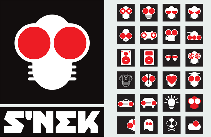
We started with the channel logo. The old one (author unknown) had several serious problems; It was very detailed (more of an illustration, rather than a logo), did not convey any message, had poor color choices and overall "cheap" feel to it. Since the channel existed for several months we could not completely break away from its current look. The new logo had to preserve the continuity in the channel ID and to build upon already established image.
Our main objective was to create a symbol which would be memorable, energetic, modern, and yet simple enough for anyone to remember and draw. Secondary concern was to allow the fly image in the logo to morph into different shapes, representing various thematic blocks of programming. After several iterations, we arrived at the final version, featuring a tri-color (black, white and red) emblem built from basic geometric forms and a bold logotype. While the symbol is based on round shapes, the type we picked is highly angular, strong and striking. Through the contrast between the two the logo gains internal energy and power.
A week before the new identity went on-air, all Digiturk channels started airing promotional teaser videos. Meanwhile, the stickers with logo morphs were planted around the city of Istanbul and S'NEK website fell under (a fake) hacker attack. Giving the audience enough clues to wonder, but not revealing what's coming, generated a lot of buzz and attention.
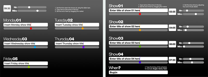
Creating line-up and promo templates was one of the most difficult aspects of the entire project. Since S'NEK did not have software and hardware supporting complex on-air, template-based live renders, we needed to design the whole thing using After Effects. At the time, S'NEK did not have operators skilled enough to entrust with modifying relatively complex compositions. We had to find a solution for that as well.
We developed a drag-and-drop system in which the After Effects operator neededs to simply import necessary footage, type in the text in several boxes and adjust a number of sliders. The program takes care of the rest through series of complex expression scripts reading the data from the "Edit" composition and applying necessary changes to the "Render" part of the project. All the crucial animation elements are locked and hidden away from the operator. Once the information is typed in, text layers adjust their content, background boxes change the length accordingly, clocks animate into correct digits, etc.
The entire final animation is generated procedurally, based on the basic initial input.
watch
Teasers
view
Bumps
view
Line-Up: Today
view
Line-Up: Weekdays
view
Line-Up: Weekends
view
credits
Date
01.06.2006
Client
S'NEK
Identity Design
Quba Michalski
Design, Scripting & Animation
Quba Michalski
Music & SFX (Stage 1)
Ferit Özgüner
Music & SFX (Stage 2)
Dağhan Kök (Retronic)
Tools
Photoshop, Illustrator, Corel Draw, After Effects
extras